Recently, Nano Banana Pro (NBP) has been on fire. We’ve seen all sorts of applications: coloring comics, generating posters, and even creating photorealistic presentation slides. They look like slides, but in reality, they are just images.
However, in actual presentation workflows, most people still treat it merely as an asset generator. They might generate a background image for a title slide, or create a few icons to drop into a deck, and then proceed with manual layout as usual.
That’s how I started, too. But after forcing myself to try generating an entire slide deck—dozens of pages—purely with NBP (rather than generating assets to assemble in PowerPoint), I suddenly realized that this new approach offers a massive advantage. Yet, simultaneously, it has glaring weaknesses and challenges. This profound disconnect drove me to spend significant time developing a complete workflow—a production-ready Generative Kernel for creating slides with NBP. It is controllable, convenient, high-quality, and I have open-sourced the relevant tools and workflow.
In this post, I want to first share why I believe generating full slides with NBP is a critical innovation. Then, I will discuss the challenges you will inevitably face, and finally, present the engineering solutions.
The Paradigm Shift: From Assembly to Rendering
I’ve always been interested in public speaking, so I constantly observe the differences between the PPTs made by ordinary people and the keynotes delivered by masters like Steve Jobs.
Putting theory aside, the most immediate impression is that master-level slides possess a strong sense of design. Every visual element has a purpose, and the overall look is incredibly harmonious. In contrast, ordinary slides—even when using a template—are mostly just boxes, arrows, and bullet points. Beyond being monotonous, they are rife with visual fragmentation; the slides look like independent elements forcibly pieced together.
The reason behind this difference isn't just the time invested; it’s the process and methodology. Our standard process is like building with blocks. Whether in PowerPoint or Keynote, we find icons, type text, draw shapes, and stack them bottom-up. Consequently, these heterogeneous materials rarely achieve visual unity. Designers, however, work top-down. They define a visual language first, determine the necessary elements to achieve that language, and then design those elements with a unified style. For them, an arrow isn't just a shape pulled from a library; it is a component that must function within the composition, lighting, and hierarchy. Visual impact and unity are the goals from day one.
The slides generated by NBP give me that distinct feeling of "design." They look like they cost a fortune to produce—professional and unified. Many of the visual effects aren't impossible to achieve in PPT, but they would require hours in Photoshop, Illustrator, or PowerPoint to create just one slide. And even with the technical skills and time, we might lack the aesthetic judgment. For example, if we were to turn this paragraph into a slide, the ordinary approach might be two boxes representing "Old Way" and "New Way" connected by an arrow. The image below was generated by NBP; the framework is the same, but the visual result is worlds apart.
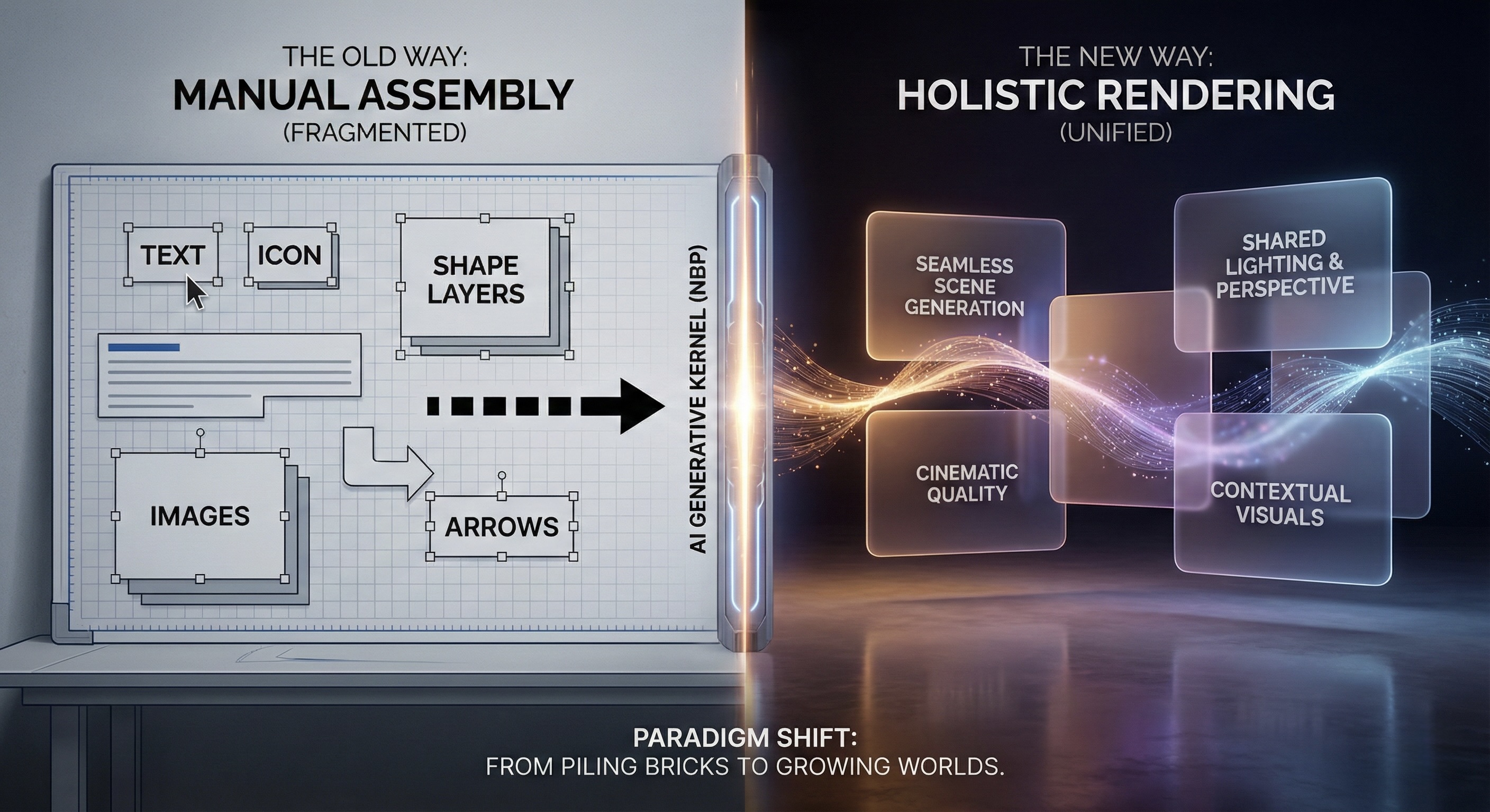
This is why I am so excited. Generating an entire PPT with NBP (rather than just the icons inside it) is a fundamental shift: it pulls us directly from Assembly to Holistic Rendering. This gives ordinary people a weapon previously out of reach: design sense. We can finally achieve "launch-event quality" visuals—previously the domain of top-tier design teams—at a negligible cost.
But the price is obvious: How do I decrease the font size by one point? If I want to move a machine gun icon 5cm to the left, is there any way other than re-rendering? More importantly, when I tried to use it to generate a serious commercial deck, I immediately hit several despair-inducing obstacles.
The Cold Reality: Dead End
If you try to implement the idea above directly—asking NBP to generate a full set of PPTs—you will quickly hit a wall. Individual images may be stunning, like the one above, but when put together, they are completely unusable. Specifically, there are several categories of problems:
First is the chaos of visual styles (Entropy). One page is minimalist white, the next suddenly becomes cyberpunk black, and the next is filled with hyper-realistic details. Individually, they are impressive. Together, they don't look like a presentation; they look like a Frankenstein's monster stitched together from random slides of different speakers. Forget about branding or themes; the impression such a deck leaves is worse than a basic one you made yourself.
Second is unreliable content (Hallucination). QR codes are the most typical example. You give it a rough description, and it draws something that looks very much like a QR code, but it doesn't scan. Even if you provide the URL text, it fails. Logos share the same issue: if you describe the "Cursor Logo" with text, it will often exercise its imagination and draw a literal mouse pointer. Correcting this takes immense effort, and if hidden pitfalls remain, discovering them during a live speech is a disaster.
Third is cost. Because it involves full-image rendering, every modification means a complete re-generation. Whether viewed from the perspective of API costs ($0.24 per image) or waiting time, it is expensive. Especially in the early stages when content changes frequently, you can easily get stuck in an awkward loop of re-drawing an entire image just to change one line of text.
Fourth is a category I thought was a problem but turned out not to be: pixel-level fine-tuning. Initially, I was anxious about not being able to precisely control font size or spacing. But after making dozens of slides, a visceral realization hit me: NBP is simply too good. The slides it outputs render these concerns obsolete; I rarely wanted to tweak details. Most of the time, the output was already far superior to my own layout skills. What really needs to change here is our expectation and habit: we should act like a boss controlling the content and broad visual framework, leaving the typesetting tasks entirely to the AI.
The final category involves problems images alone cannot solve. Slides are not just visual backgrounds; they need selectable text, speaker notes, etc. These cannot be expressed by static bitmaps. Purely using NBP to generate images might solve the problem of "looking like a PPT," but there is still a long road to a presentation that can actually be delivered.
So, my initial intuitive impression was that the advantages and disadvantages were equally prominent. But because the design quality was such a massive leap forward, it motivated me to analyze why these problems exist and whether we could design a workflow or mechanism to solve them.
The Breakthrough: Building a Container for Uncertainty
Facing these challenges, we must first ask: Is this a model capability issue, or are we not providing enough information? One way to think about it is: if my boss gave me this task, could I complete it? My answer is no. Because AI has no memory. Its only source of information is the current prompt. In other words, the first slide and the second slide are completely independent events, so distinct visual styles are entirely normal.
Therefore, even if the next generation of NBP is 10 times smarter, it won't solve our problem. Instead, we need better engineering architecture to constrain AI behavior through Context Engineering. We need to treat generative AI like NBP as a probabilistic tool full of creativity but highly unstable, and then use software engineering methods to build a deterministic container to constrain it. This is a major reason why we proposed the Generative Kernel: to encapsulate uncontrollable artistic rendering within controllable code logic.
First, I addressed the functional deficits and interaction issues. Since static images can't handle speaker notes, we shouldn't force them to. In this workflow, I continued to use reveal.js, a web-based presentation framework, as the skeleton. It bears the burden of all deterministic logic: slide structure, clickable links, speaker notes, etc. The images generated by NBP are no longer the slides themselves but step back to become the underlying visual texture (technically, the background image of each webpage). This way, we separate the concerns of function and aesthetics: code handles deterministic interaction, and AI handles flexible art. Interestingly, in the generated PDF, text remains selectable in browsers and Mac Preview, likely due to background system OCR.
Next is the headache of visual consistency. As we introduced in this article, language is incredibly pale when describing visual styles. To constrain AI's visual output, the most efficient method is not longer prompts, but providing an image example directly. Thus, we adopted an Image-to-Image strategy: spend effort creating one "Anchor Image" (using AI to render code, NBP generation, or even a hand-drawn sketch), and feed it as raw material for subsequent generations.
This constrains the AI far more effectively than language. For example, when making the PPT for our AI Competency Matrix, I needed to draw a staircase in the upper right corner of different slides, highlighting different levels (e.g., highlighting L3 when talking about L3). Simply saying "draw five steps, unified style" was useless; AI still had too much room for interpretation. I eventually generated one image with NBP and used it as the input asset for these slides. Through this method, we forcibly locked visual consistency while retaining AI's rendering capabilities.
For elements that absolutely cannot be wrong, like Logos and QR codes, the logic is the same. Don't let AI "draw" a Logo; inject the correct Logo image as an asset. The AI's task shifts from creation to synthesis based on assets. It automatically analyzes the ambient light, adds reasonable shadows and texture to your Logo, and blends it perfectly into the background without tampering with the Logo's geometry. This technique of Context Curation completely solves the hallucination problem.
Finally, cost control. Since full-image rendering is expensive and slow, the solution is a software engineering technique: Delayed Rendering. In our workflow, we spend the vast majority of time dealing with pure text. We use AI to write all content and logical structures in Markdown, and we review them. Only after everything is finalized and locked down do we trigger NBP for batch low-resolution rendering. Once satisfied, we upscale to high resolution. This minimizes the cost of trial and error and allows us to focus on the content itself without being interrupted by pending images.
Through this combination—code as the skeleton, assets as constraints, and process for cost control—we have actually built a reusable Generative Kernel. It turns that crazy idea into a viable engineering solution. For instance, the slides for this article can be viewed here. Note that you can press 's' to bring up speaker notes and the control panel.
Conclusion: Delivering the Capability to Generate
Looking back at the process, we have gone far beyond the scope of making a PPT.
As mentioned in a previous article, in the era of AI-native software engineering, we no longer deliver a static finished product, but a kernel capable of continuously producing finished products (Generative Kernel). This NBP presentation project is a standard Generative Kernel.
This Kernel has been open-sourced on GitHub. Note that "open source" here refers to more than just the final HTML files and beautiful glass-textured images. Those are just the results of this specific run. What we are truly delivering is a reusable generating capability.
A complete Generative Kernel contains three core parts, none of which can be missing:
- The Deterministic Skeleton: This is the code part of the Repo. It defines what the presentation looks like physically: which areas are clickable, where speaker notes appear, and how slides transition. The goal of this layer is singular: deterministic control. We try to lock down interaction logic with code, leaving no room for AI error.
- The Automation Pipeline: This is the
tools/directory in the Repo. We wrote command-line tools likegenerate_slides.pyandgemini_generate_image.py. They are responsible for stringing images, Markdown content, and HTML structures into a stable pipeline. For example, if we markAsset: imgs/qr_code.pngin Markdown, the script automatically handles rendering, mounting, and path mapping. This ensures the process is reproducible, rather than relying on luck in a chat interface. - The AI-Readable Instructions (SOP): This is the most critical and easily overlooked part—
AI-instructions.md. It is essentially a System Prompt. We solidified the visual metaphor of the "Glass Garden," the operation process of Visual Anchoring, and the principle of "modify Markdown first, then render" into this document.
This brings about a conceptual shift: We no longer assume humans are the main force and AI occasionally helps; instead, we assume AI is the primary executor, and humans are responsible for designing rules and expressing intent. This document is the AI's onboarding manual, allowing it to perform at the level of an L5 engineer from the very first second it takes on the task.
If we look at this in a broader context, it demonstrates the change in software deliverables in the AI era. In the traditional model, we deliver a .pptx file; the user gets a fish. But in the Generative Kernel model, as long as these three modules (Skeleton, Pipeline, SOP) are in hand, the specific content, theme, and style can be swapped at will.
- Today we are discussing Nano Banana Pro using the "Glass Garden" style;
- Tomorrow, for quarterly OKRs, we can change the visual metaphor in the prompt to "Minimalist Concrete" and swap the Logo asset for a department icon;
- The day after tomorrow, to generate a workshop deck, we only need to change the Markdown outline.
Users don't need to design the workflow from scratch every time, nor do they need to re-encounter the pitfalls of unscannable QR codes or unstable styles. The wisdom to solve these problems has been encapsulated in this Kernel.
For me, this experiment proved that we can completely generate PPTs using NBP. While this is delightful, the validation of the Generative Kernel approach and workflow is even more exciting. Even for an idea that sounds this crazy—completely abandoning layout software and replacing PPTs with a pile of static images—as long as we are willing to deconstruct it from an engineering perspective, separate uncertainty (artistic rendering) from certainty (interaction logic), and glue them together with an SOP, we can build a reliable production system.
If you are also using LLMs to create content or tools, I suggest examining your workflow from this angle: Are you currently delivering one-off results, or a Generative Kernel that can be reused by AI and humans? The former forces you to start from scratch every time, while the latter is an asset that belongs to you and compounds over time.