The premise was simple. The European Space Agency launched a satellite called Gaia in 2013. Over more than a decade, it photographed and measured the entire sky, and by its 2022 data release it had cataloged the positions, magnitudes, distances, spectra, and other measurements for 1.8 billion stars. In perpetually rainy Seattle, a very tempting experiment came to mind: if I used the data for all 1.8 billion stars, could I render a photorealistic Milky Way image and outcompete all you astrophotographers from my keyboard? Of course, there is one major limitation here: the Gaia catalog only contains stars, not nebulae, so the final image would not include reflection nebulae, emission nebulae, or other deep-sky objects. But the part I was curious about was this: maybe the structure of the Milky Way would still appear?
This did not seem hard. Every star already had a position, brightness, and color. Just draw them on an image, right? So I had AI write the most direct, least clever program possible in 10 minutes. The program did exactly what I asked, but the rendered result looked nothing like the night sky we see (Figure 1). What followed was a full week of modifying the program, failing, modifying it again, failing again. Those repeated failures made me realize that the whole exercise meant more than I had expected. Its real goal had moved beyond "simulate a photorealistic image so I can do keyboard astrophotography on cloudy days". It was making me realize that I, and probably we, had never really thought about why the sky above us looks the way it does.
This article is about that exploration and where it ended. We will start with the simplest possible rendering method, then gradually add the physical principles that matter, watching the simulation become more realistic step by step. Through that process, we can understand which mechanisms most strongly shape the sky we see. Once that simulation pipeline works, we can also try some unreasonable experiments. Since the Gaia catalog gives us each star's direction and distance, it also gives us their positions in three-dimensional space. If the pipeline is working, we can even place a virtual camera above the Milky Way and look back down at the galaxy to see what its disk structure looks like.
Learning from Failed Simulations
So let us go back to the beginning and look at this image:
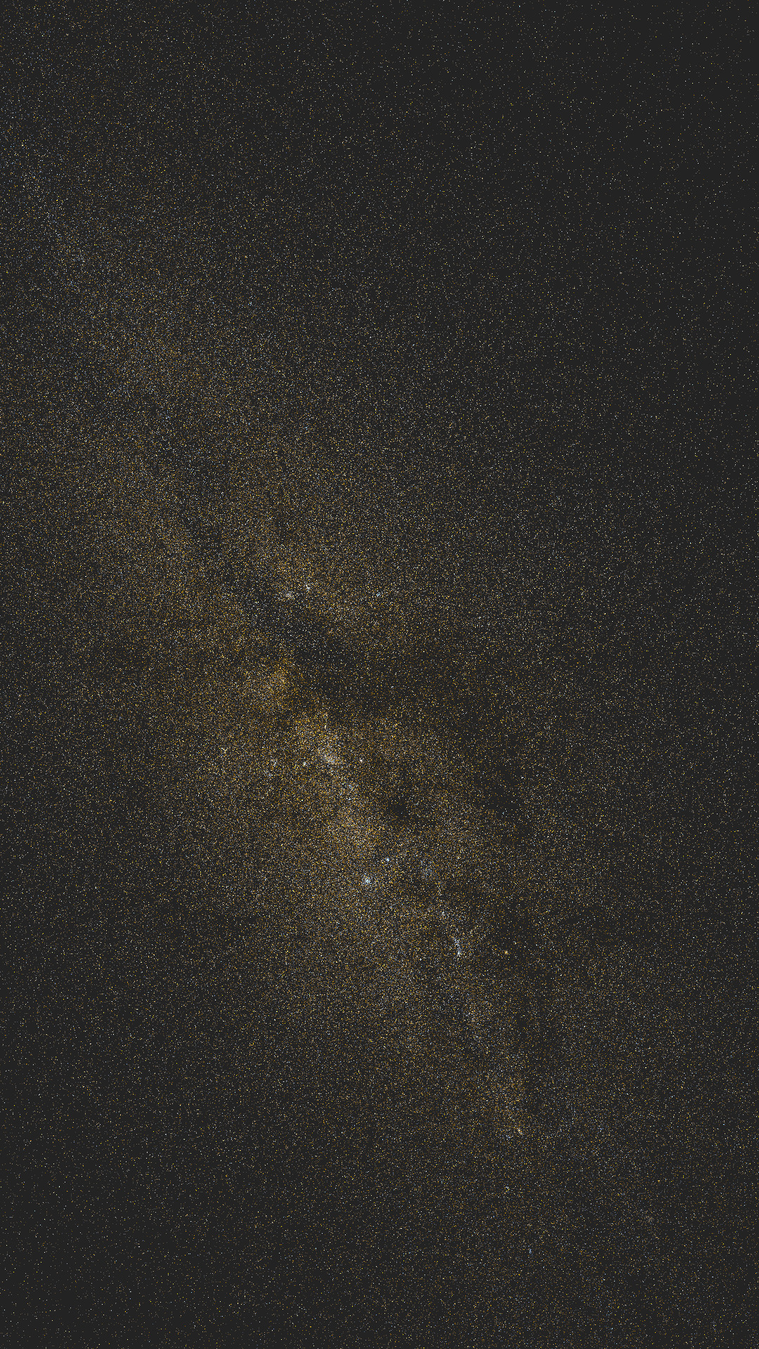
Figure 1: G<11 stars, one pixel per star, no post-processing
This is what you get by plotting the stars brighter than magnitude 11 from the Gaia catalog. For each star, the program computes its position on the image from right ascension and declination, then draws a point using its color and brightness. The image has a faint hint of the Milky Way, but it clearly looks very different from the night sky we are used to. The biggest difference is that the bright stars are missing. Whether visually or in photographs, when we look at a summer Milky Way image, the first things we usually notice are the Summer Triangle, Altair, Vega, and Deneb, and at lower latitudes Antares. This image has none of them, which makes it look very strange.
There are two reasons for that. First, Gaia carries extremely sensitive photometric instruments, so during observation it intentionally avoided the famous bright stars across the sky to avoid damaging the instruments. Thanks here to Hamster and Liunian Zhihou for pointing this out. That means we need to manually add those well-known bright stars from other catalogs.
The second reason is that, whether we look with our eyes or with a camera, bright stars tend to appear larger than dim ones, even without diffusion filters. This is quite counterintuitive. Stars are so far away that, from the perspective of an optical system, each star is a point source. When a point source is magnified by a camera lens, it should become brighter, not larger, so that alone cannot explain what we actually observe. That theory is correct, but it misses one detail: although a star is a point source, the optical system is not perfect. It turns each star into a blurred spot with finite size. When a star is brighter, the visible portion of that spot becomes larger. As an analogy, each star is like a mountain: bright stars are taller, dim stars are shorter. A taller mountain occupies more ground area than a small hill. At the same time, both retinas and sensors introduce internal reflection and diffraction, which add extra halos. These effects together explain the visual appearance.
Once we know that, the rendering fix is straightforward. We need to start from physics and apply a blur operation to every star. The technical term is introducing a PSF, or point spread function. This way, brighter stars naturally spread into a halo. I excitedly added this principle to the program, and the result is shown in Figure 2.
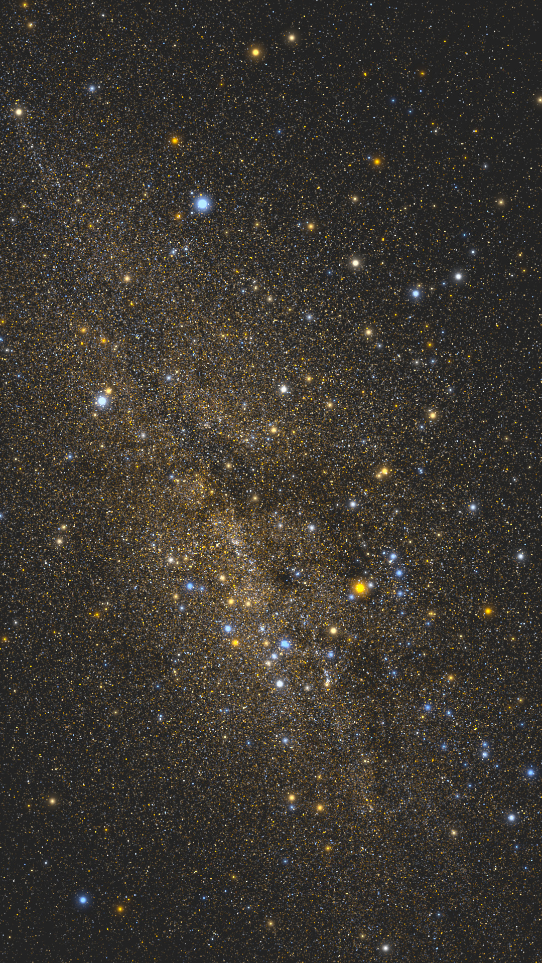
Figure 2: After adding PSF and bright-star supplementation, bright stars have halos, but the Milky Way is still faint
Altair, Vega, and Antares are now easy to see. From the bright-star perspective, this is obviously closer to the sky we see in practice. But there is still one big problem: where did the Milky Way go? We had already rendered hundreds of thousands of stars brighter than magnitude 11, but the Milky Way itself remained very faint. At first, we assumed there simply were not enough stars, so we extended the rendering range to millions of stars brighter than magnitude 13. The result is shown below. It did not change much.
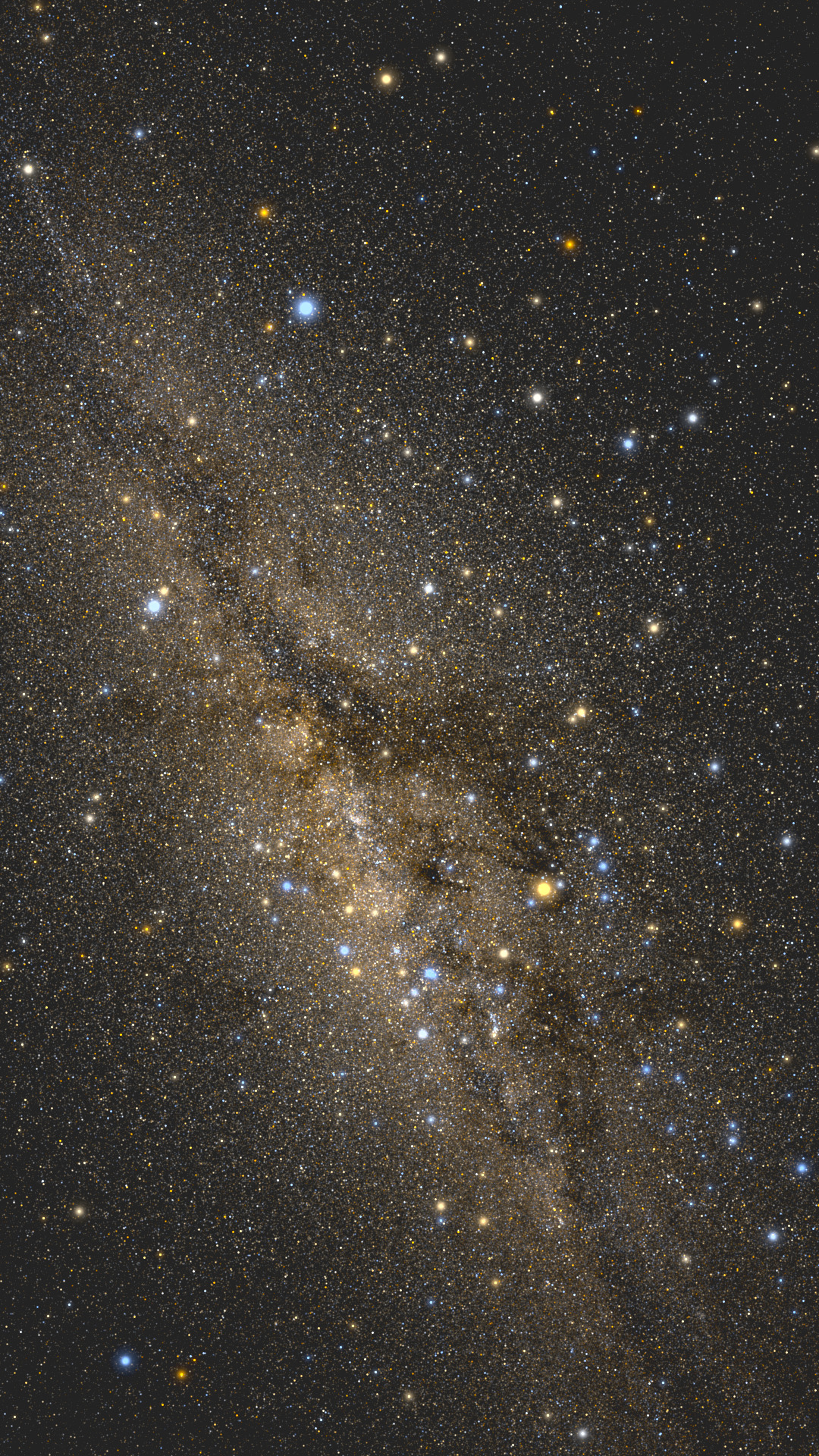
Figure 3: Extended to G<13, millions of stars, the Milky Way is still faint
After more research, I learned that the Milky Way is bright mainly not because there are many bright stars, but because there are many, many faint stars. These faint stars cannot be distinguished visually. They merge into a continuous whole and together form the soft glow around the galactic center. For our simulation, there is a simple shortcut: an empirical relationship in the luminosity distribution. Different stars have different magnitudes. For example, when we move from magnitude 8 to magnitude 9, each individual star becomes dimmer, but there are also more stars at that brightness. Coincidentally, across a fairly large magnitude range, the total amount of light works out to be roughly the same. In other words, the total light emitted by all magnitude 8 stars, meaning the integral of their flux, and the total light emitted by all magnitude 9 stars look about the same to us. So even though we do not know the exact details of stars fainter than magnitude 13, we can use magnitude 13 stars to approximate the light they emit. After all, there are already millions of magnitude 13 stars, so distinguishing their spatial positions more finely is no longer very meaningful. By multiplying the brightness of magnitude 13 stars by a coefficient, we can simulate the luminosity of all stars fainter than magnitude 13 quite realistically. The result is shown below.

Figure 4: Using magnitude 13 stars with a gain factor to stand in for fainter stars, the Milky Way glow appears, but the color is too yellow
The Milky Way finally appeared. That result was very exciting. But we quickly found two problems. The first was color. The Milky Way in real photographs is usually not this yellow. Fortunately, this problem was relatively easy to solve. The colors in this image were computed with a very simple formula. If we introduce the actual physical process, estimate stellar surface temperature by calibrating against main-sequence stars, and then compute color temperature using the black-body radiation formula, we get the image below. The color looks much more normal.
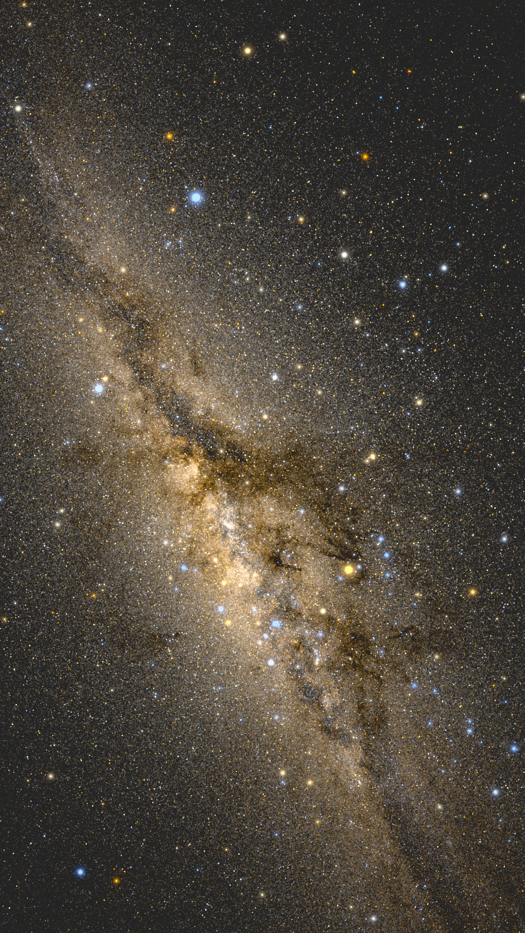
Figure 5: After black-body radiation color-temperature calibration, the colors look normal
The bigger problem was the shape of the Milky Way. If you look closely, the image feels somewhat like the Milky Way and somewhat unlike it. Around the galactic center, there are many textures that do not appear in real photographs. For example, the central rift seems to split into two branches near the galactic center and then merge back together. From a distance, it even looks like the Chinese character zhong. This was a very strange problem, which meant either our data or our rendering process had a serious issue.
I was stuck here for quite a while. Many optimizations did not help. Eventually, I thought to extend the magnitude limit from 13 to 15, then 18, and even 20. Only after precisely integrating the flux from 600 million stars did the familiar Great Rift finally appear, as shown below.
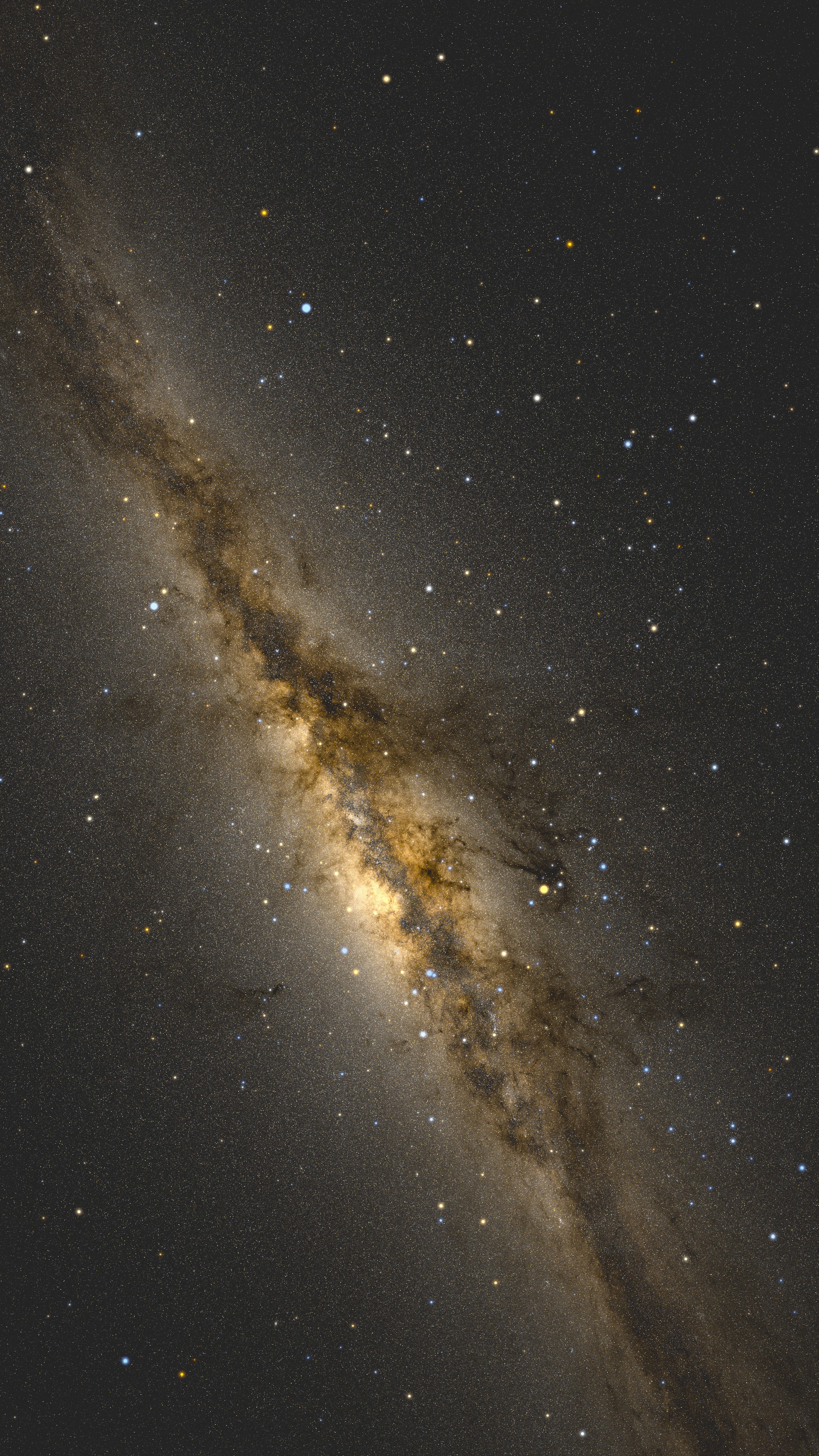
Figure 6: Extended to G<18, 600 million stars, the Great Rift finally becomes cleanly dark. Click the image to open the 4K preview.
Comparing these two images, the main reason the previous one looked wrong becomes clear: the spatial positions of magnitude 13 stars and fainter stars are still not quite the same. Stars fainter than magnitude 13 are more concentrated on both sides of the rift. Although each star is very dim, their enormous number produces the faint glow around the galactic center, while also making the central rift more distinct.
This part of the simulation felt like solving the problem through brute force rather than cleverness. In the previous step, we introduced an empirical luminosity formula. It looked sophisticated and saved computation, but the approximation also introduced a ceiling that was hard to break through. Once we had enough data, we no longer needed the earlier trick at all. The most direct rendering formula produced a very good result. In a later article, we will use the same idea to simulate the turquoise band during a lunar eclipse, and we will see a similar lesson there.
Light Pollution and Wandering the Sky
At this point, the simulation itself was basically complete. The full-resolution 40-gigapixel Milky Way can be browsed here: https://yage.ai/gaia_milky_way/
But beyond looking like a photograph to the naked eye, is there a way to quantitatively verify that the simulation is correct? One idea is to introduce light pollution. On one hand, light pollution is a physical quantity that can be measured. Each Bortle dark-sky class corresponds to a range of background sky brightness, in magnitudes per square arcsecond. That lets us quantitatively simulate how the Milky Way appears under different light-pollution conditions. On the other hand, people are also familiar with how the Milky Way looks under different Bortle classes. For example, under Bortle 6 skies, you may still faintly catch a bit of the Milky Way with averted vision. At Bortle 7 and above, it is basically gone. Putting these two together makes this a good validation test.
So I tested how the Milky Way should look under Bortle 7 light pollution. My program confidently said: no problem, it is very clear. The result is shown below.
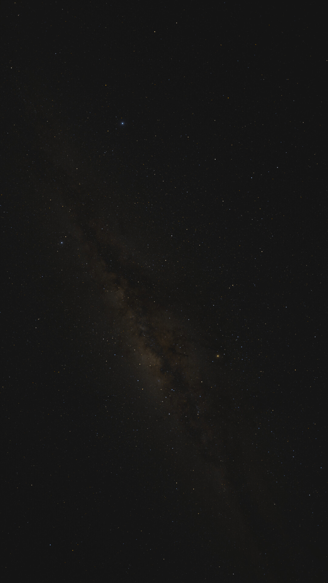
Figure 7: Under Bortle 7 light pollution, without the Weber threshold, the Milky Way is somehow still visible
That was strange. It meant our rendering pipeline still had a problem. After more research, I found that this was not a physics problem, but a physiology problem. The human eye has an important property: whether you can see something does not depend on its absolute brightness, but on how much brighter it is than the background. For example, when we say the human eye can see magnitude 6 stars under dark skies, that does not mean the eye can also see a diffuse nebula or glow whose total integrated magnitude is 6. When the sky background is bright, diffuse structures need to be much brighter to become visible. Therefore, we needed to use this property, technically called the Weber threshold, to calculate the Milky Way's relative brightness. After adding this physiological model, we quickly obtained a simulation that matched reality. The image below is the Milky Way under Bortle 7 light pollution:
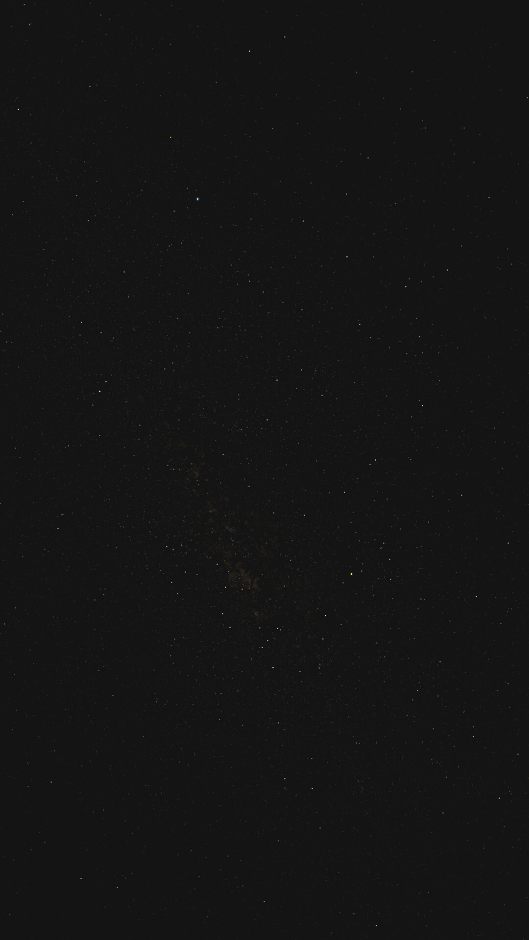
Figure 8: After adding the Weber threshold, the Milky Way disappears under Bortle 7 light pollution, matching real observations
We failed many times along the way, but each failure gave us a valuable lesson, corrected an inaccurate understanding, and brought new knowledge. I think that training process, and the knowledge it produced, is more meaningful than getting the final image. I have learned a lot of astronomy and physics. I can explain many phenomena and even solve many problems. But the only real test of knowledge is practice. We built a simulation pipeline from what we had learned, and when its output was wrong, that meant our understanding was incomplete or incorrect. Continuously adding more factors, discovering which ones mattered and which ones did not, became an excellent learning opportunity in itself.
Simulation also has a major advantage over real photography: it opens up countless possibilities. For example, we live inside the Milky Way, so how do we know what the Milky Way looks like from the outside? The Gaia catalog gives us one route. If we know each star's right ascension, declination, and distance from us, then its position in three-dimensional space is determined. So in principle, we can place a virtual camera above the Milky Way and photograph it from above. Would that reveal a perfect spiral or barred spiral structure? Unfortunately, I tried simulating exactly that, and the result is shown below.
Figure 9: Simulated view from above the Milky Way, with no spiral arms visible because Gaia parallax distances only cover a few thousand light-years around the Sun
This does not mean our Milky Way really looks like this. It is a limitation of Gaia's distance measurements. Gaia uses parallax, which is the same principle as our ability to sense how far away an object is using two eyes. This method works well for nearby objects. For example, you can easily tell whether something one meter away or two meters away is farther. But it becomes useless for very distant objects. With the naked eye, it is hard to tell whether something 100 meters away or 110 meters away is closer. Gaia has the same limitation. Within a few hundred to a few thousand light-years, its distance measurements are still fairly accurate. But the Milky Way is on the scale of 100,000 light-years, far larger than that range. Therefore, for most stars, our grasp of their distances is very rough, and a clean spiral shape naturally cannot emerge from the data. At the same time, the direction of the galactic center contains a large amount of dust extinction, so our data is incomplete there as well. Together, these two factors produce the messy-looking image above. In fact, so far humanity has no way to directly photograph what the Milky Way looks like. The face-on Milky Way structures we see online are all indirect observational inference plus artists' imagination. In a sense, we had run into the boundary of current human technology.
Beyond this, we also ran many other experiments. For example, we can make a video showing how to start from a wide-field image and zoom all the way into very deep-sky photography at an astonishing magnification. We can also simulate what kind of Milky Way your camera would capture under different exposures, or what the Milky Way would look like under different light-pollution environments if humans had superhuman eyes. All of these simulation results are on the project homepage: https://grapeot.github.io/gaia_allsky/. The full code is open source as well. I am sure there is still plenty to improve in this implementation, and comments and feedback are very welcome.
Continuous zoom from the full sky into the galactic center at 1:1 scale. No audio.